
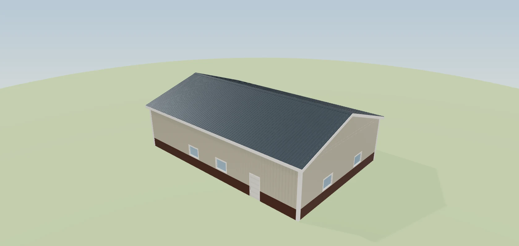
When the job starts, the estimate link becomes the project dashboard. Same address, nothing to install, no password. On a job designed in Leads 2 Build the hero is their actual building in 3D — they can spin it, pull the roof off and look at the framing. Under it: the project total with every approved change in it, the phase underway, the milestones your crew ticks, the photos from site, the selections waiting on their choice, the invoices with their own copy to download, the signed agreement, and a running feed of what happened and when. Every block on it is a switch you control. The post-frame and barndominium operating system, so the phases on the page are the ones a pole barn or a barndo actually goes through — permits, posts, trusses, steel, finish.
Also called: customer build tracker · project status page · client dashboard · track my build
The same link becomes the project page
No new address, no login, no app. The link they opened to approve the estimate is the project dashboard now — so it is already in their email, already on their phone, and already the thing they show their spouse. Before you start the job there is no project page yet, and what sits on that link while they wait is on the customer link page.
A second address with its own login is something you end up explaining on the phone, one customer at a time, for the length of the build.
Customers won't sign up for a portal — but they'll open a page they already have. The link they approved on simply becomes the project page the day work starts, so the calls asking 'any update?' stop without anyone having to adopt anything.
Their building, in 3D, at the top
Try itThe hero is not a photograph of a building like theirs. It is the model you designed, and they can drag it around, switch to the front or the gable end, and pull the roof off to see the framing underneath — the same viewer they had on the quote, still there once the build is live.
They have paid six figures for a building they have only ever seen as a line on a quote, so half of every conversation is them describing it back to you to check you agree.
A customer who can spin their own building on their phone feels it's real — and tells people about it. The hero runs the same model the estimate was priced from, down to where the doors landed. A SmartBuild estimate has no model, so the row isn't offered rather than shown empty.
The four numbers they actually ask about
Project total, the phase underway, the date they approved it, and milestones done out of the total. This is the answer to any update? rendered as four tiles, which is why the question stops being asked. The total is the one customer figure the whole system uses plus every approved change order, with incl. $8,150.00 in approved changes written under it — a change they haven't signed isn't counted.
Half the calls you take are somebody confirming a figure — and the other half are about why the final invoice is higher than the number on their page.
The first number a customer sees is the one they remember. Four tiles answer the questions behind most calls, and a total that already carries the changes they approved means the last invoice confirms what they expected.
What's done, and what's next
The header names the phase underway and the next milestone due, and the segmented bar underneath gives each phase its own stretch, weighted by how many checkpoints it holds. Nobody types this in — the bar moves when somebody on site ticks a box, and the lists behind those boxes are laid out in stage checkpoints.
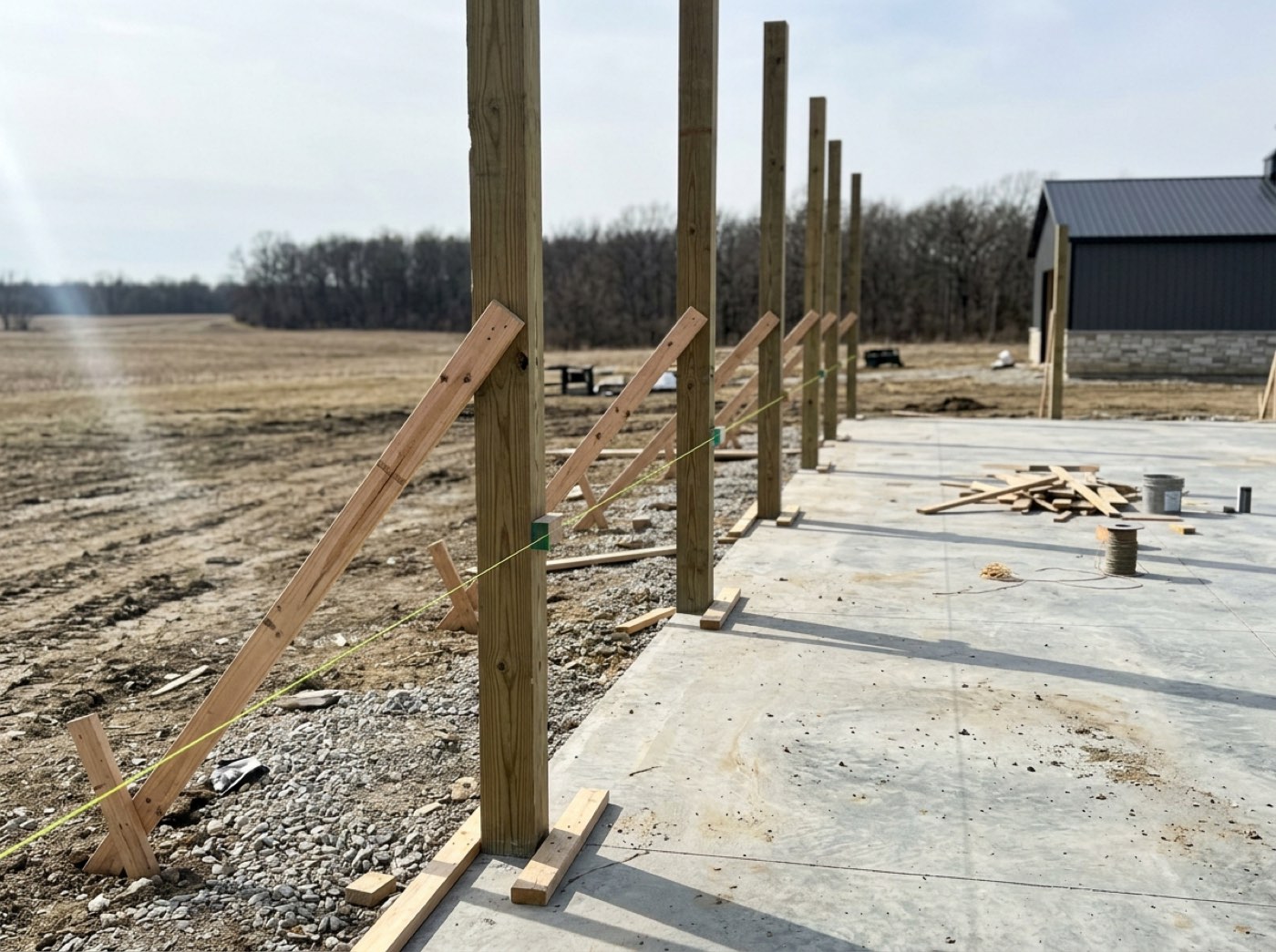
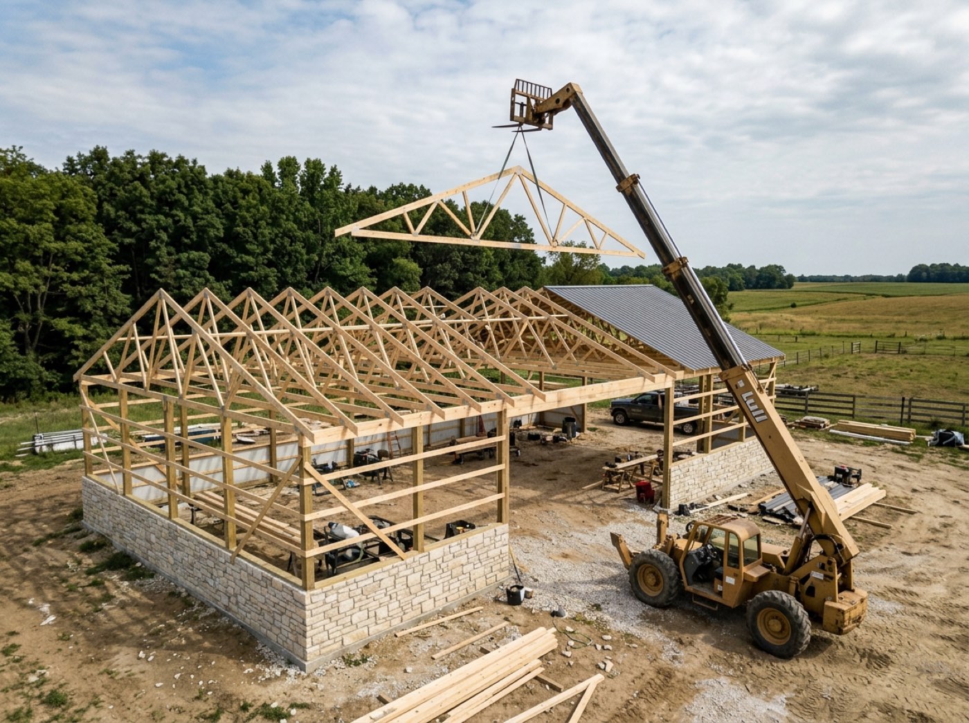
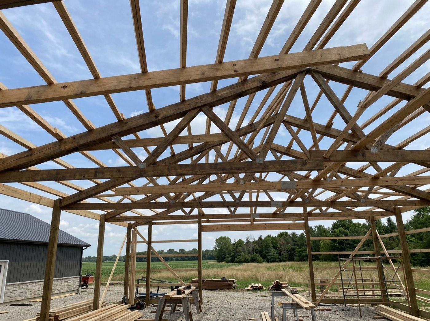
The Friday update to every live customer is the first thing dropped in a busy week, and that is the week they decide you have gone quiet.
A customer who can see where the build is stops wondering if anything is happening. A segment per phase — framing half done, siding not started — reads like a map, so they see progress rather than a vague percentage.
A checkpoint that doesn't apply is not shown as skipped
On a live job the checklist is frozen, so a checkpoint this building never needed is marked not-applicable rather than deleted. The customer's page never receives it at all — it does not sit on their dashboard permanently unticked.
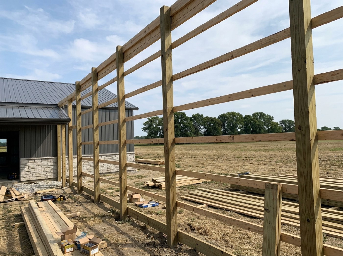
There is no gutter run on this build, so gutters hung sits unticked on their dashboard for four months and reads as work you skipped.
A customer who sees 'skipped' thinks a corner was cut. Rows that don't apply to this job are removed before the page is built, so the checklist only shows work that's really part of their building.
Photos from site — the ones you chose
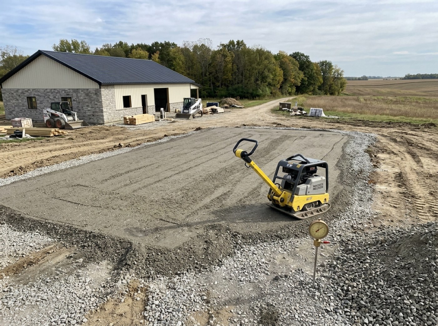
Your crew shoots everything. The muddy pad at 6am stays in the office; the finished gable goes to the customer. How a photo gets onto this page at all — shot on the crew's phone, and one of two buttons deciding the customer ever sees it — is jobsite photos.
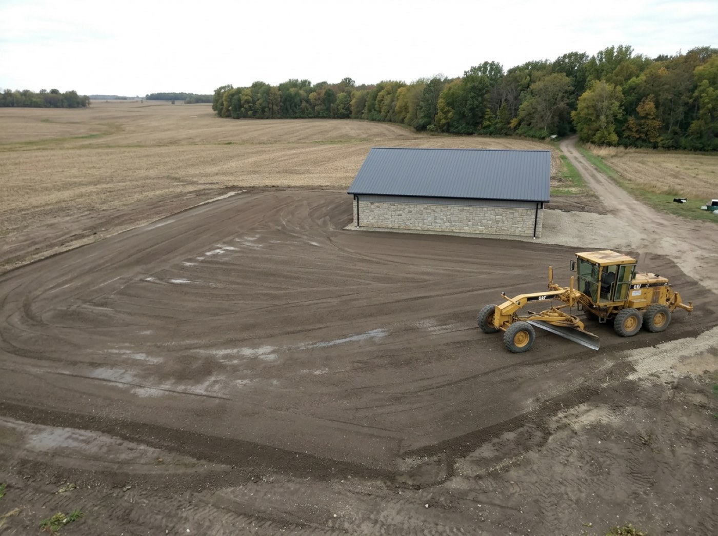
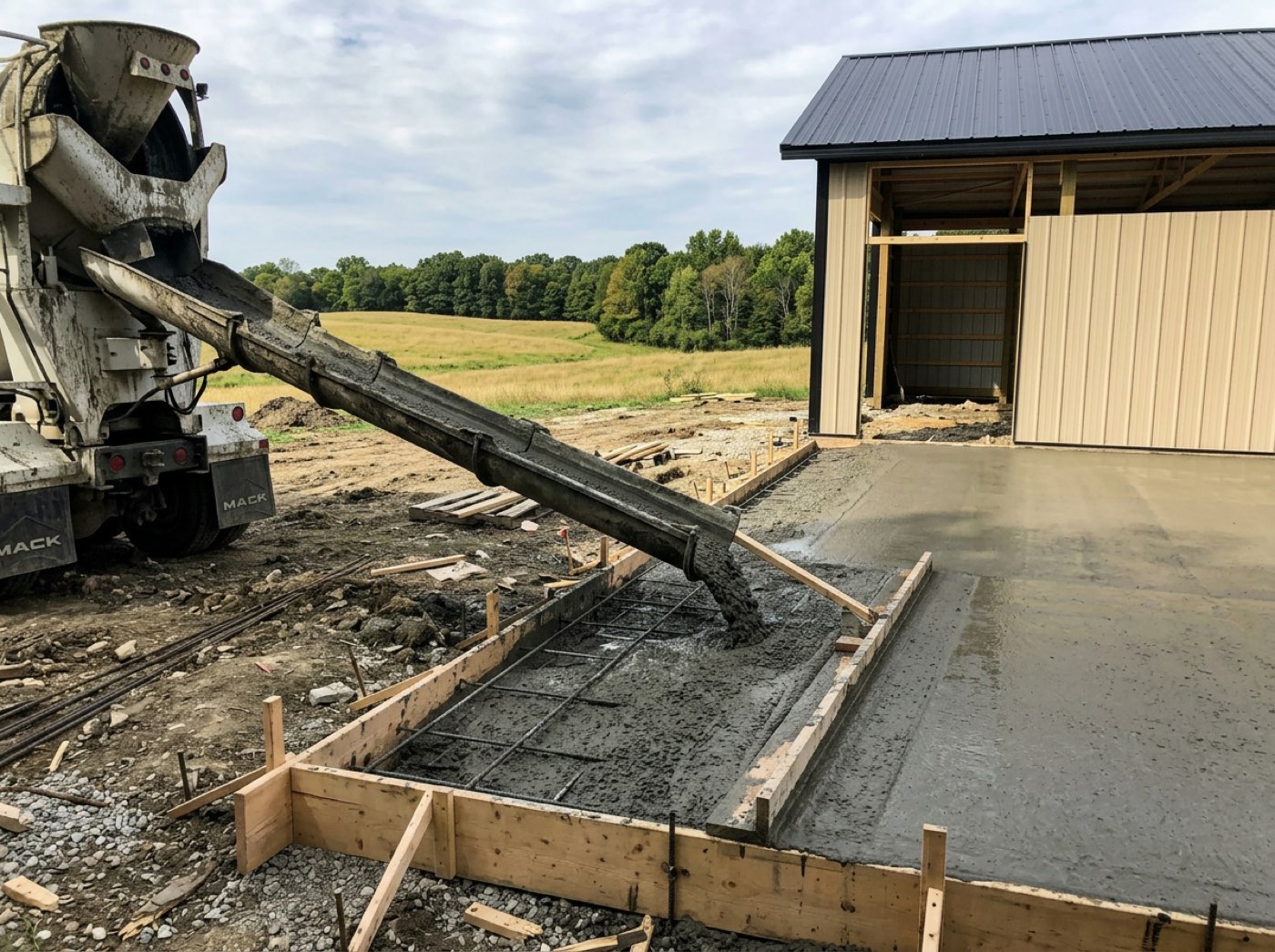
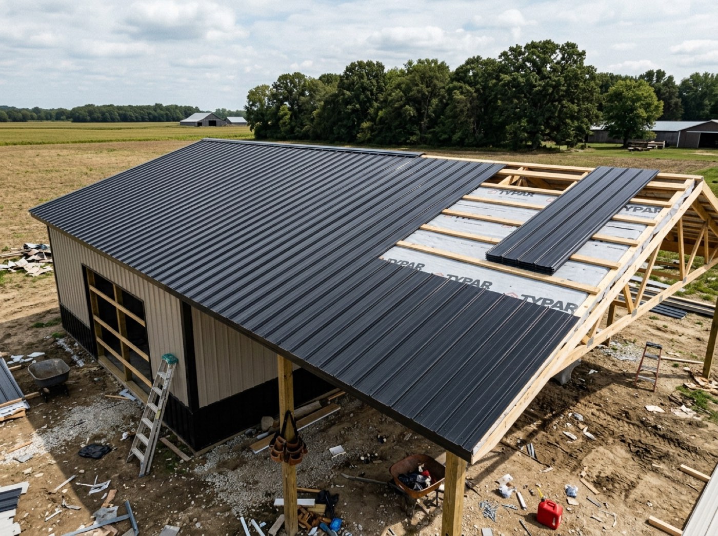
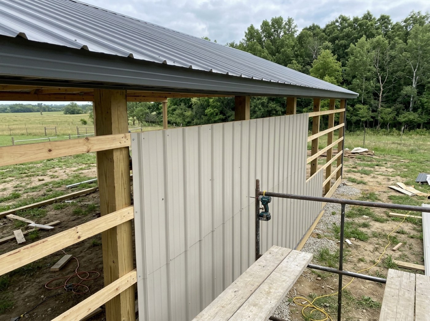
One shot of a rutted lawn or a half-stripped form reaching the customer costs you an afternoon of reassurance you never owed.
Photos of their own posts going in are what customers share with family. Only shots stamped customer-facing ever reach the page, so the crew can photograph everything and the builder decides what the customer sees.
A running feed of what happened, and when
Try itEvery completed milestone, in order, with its date. It answers the question behind the update call — not just where are we, but has anything moved — and it quietly documents that you were never idle. Entries land while the customer is looking, which is how the page keeps itself current.
A customer who cannot tell a slow week from an abandoned job assumes the second one, and you hear about it in the tone of their next call.
When a date gets questioned months later, the feed settles it. It opens five at a time, then all, then folds back — so the customer can follow along today and you both have the history later.
Their selections, chosen on the page
Try itWhen a job carries allowances — flooring, cabinets, lighting — a Your selections card appears on the dashboard. Each allowance shows what the contract includes and the options you offered, each with what it does to their total in plain words — $1,240 over your allowance, $300 credit. The customer types their name to choose, you approve the pick, and the difference goes onto the contract as an approved change order that the project total picks up. Prices only — your cost never reaches the page. How allowances are set up is on selections & allowances.
The customer picked "the nicer flooring" at a showroom, nobody wrote down what it did to the price, and the final invoice is $4,600 higher than the number they remember.
A choice made with the price on screen is a choice nobody disputes. Customers enjoy picking their finishes, the builder gets every upgrade priced and signed before it's ordered, and the last invoice holds no surprises.
Invoices — paid and outstanding, at a glance
Try itEvery invoice on the job, with what's outstanding stated in one figure at the top. They stop asking which ones they've already covered, because they can see it. Nothing on this page writes a bill — pulling the lines off the estimate and the schedule, sending it, and fixing a number you got wrong all happen on your side, under invoicing.
Twice a month somebody asks which invoices they have already covered, and answering it means going into your books on their behalf.
Customers pay faster when they can see exactly what's owed. The card is a read-only view of your own invoice list, so there's one place to correct a mistake and the correction reaches them without a resend.
The one live question is answered before they scroll
The card heads with the outstanding total, or All paid in full when there is nothing owing. On a job billed six times, five settled invoices used to push the single outstanding bill down the list and bury the only thing the customer opened the page to find.
They ring on a Tuesday to ask whether the second draw went through, and answering it means opening your books on their behalf.
'Do I owe you anything?' deserves a straight answer. The head figure is summed from live balances, so a customer who's square gets a sentence instead of a list to audit.
Oldest due first, and overdue says overdue
Try itUnpaid invoices sort by due date, so the one to pay next is the one at the top. A bill past its date carries an overdue marker worked out from the date itself — not from a status somebody remembered to change.
Chasing a draw is a phone call you have to make; a customer who can see which one is late usually saves you it.
A late bill that reads as current is one a customer never reports. Overdue is worked out every time the page draws, so it can't lag — and the oldest bill sits first, where it gets paid first.
Paid invoices fold away but stay one tap from the page
Try itSettled invoices collapse behind a toggle that says how many are back there. Folded never means gone — a paid invoice is the customer's receipt, and it is what they come back for at tax time, or what a lender asks for mid-build.
Their accountant wants the March draw in February, and the only copy is an attachment on a thread neither of you kept.
Customers want a tidy page and a complete history. Paid invoices fold away with the count showing, so nothing reads as deleted — and you never end up emailing an eight-month-old document.
Their own copy of every invoice
Tap one and it opens as a proper document in your branding — your logo, your address, the line items, the terms, the payment instructions — with Download PDF on it. Tapping an invoice here opens the bill itself, and the link it rides on, the print button and the paying are covered on the public invoice document.
Find the PDF, attach it, send it — then do the whole thing again a fortnight later because it went to spam.
The 'can you resend that invoice?' email is a job that should stop existing. Each invoice opens from its own link as a finished document, with terms, payment instructions and what's already paid travelling with it.
A half-written invoice cannot appear on their page
Drafts never leave your side, and an invoice you deleted is gone from the customer's view too. Of every screen that has to honour a deletion, this is the one where getting it wrong is visible to the person who was billed. Voiding, deleting and reversing are three separate remedies — they live under invoice corrections.
You start a draw invoice on Thursday, get a number wrong and leave it half-written, and the customer reads it as a bill and rings about it on Friday.
A customer who sees a draft bill rings in a panic. Drafts and deleted rows never leave the server, so a half-written invoice can't be revealed by anything on the page.
Reading a bill never costs the customer their place
Try itInvoices, agreements and change orders open over the dashboard rather than navigating away from it. Tap outside or press escape to close, and the page is exactly where it was, scroll position and all.
They open the second draw to check one figure, land on a separate page, hit the browser's back button and are dropped at the top of the dashboard, past everything they were reading.
Nobody likes losing their place on a long page. The panel holds the dashboard still underneath and puts it back when closed, so reading a bill never sends them hunting.
Paying opens a tab, and the balance catches up when they come back
Try itCheckout refuses to load inside a frame, so Pay hands the customer a fresh tab and leaves the dashboard where it is. Coming back to the dashboard re-reads the invoice, so the status and the remaining balance update in place rather than showing them a bill they have just settled. Where the money lands afterwards is QuickBooks.
They pay, come back, and the invoice still shows the full amount due — so the next call is asking whether the money arrived.
A customer who just paid shouldn't still see a balance. Checkout opens in its own tab and the dashboard refreshes the moment they come back, so 'did you get my payment?' never needs asking.
One document, whether it is a link, a panel or a sheet of paper
The same invoice renders standalone at its own address, inside the dashboard, and on paper — from one build. Two builds means the printed copy and the on-screen copy disagree eventually, and the customer finds the difference before you do. All three carry the brand you set once.
The printed copy says one total and the page says another, and the discrepancy is now yours to explain.
What a customer prints should be what they just read. Paper comes from print rules on the same page, so the link, the panel and the printout are always one document.
The signed agreement stays retrievable
The executed contract lives on the page permanently. Not attached to an email from four months ago, not in a spam folder. Both signatures, both dates, and a download button — the document that came out of the signing page, unchanged.

Four months in they want the contract, and the copy of record is an attachment in a thread neither of you can find.
When a lender or a spouse asks for the contract, the customer should be able to fetch it themselves. The card appears only once both sides have signed, so the copy they can download is the copy that's actually in force.
Mid-job changes, in writing, on the same page
A change order is priced, signed and filed where the original agreement is — so what was agreed and what changed live in one place, not a text thread nobody can find in a year. Pricing one, getting it signed and putting the added days on the record is all in change orders.
The lean-to was agreed by text in July; by November nobody can say what it cost or who said yes to it.
Changes agreed in the truck turn into arguments at the final invoice. Signing each one on the page — with a reason required to decline — keeps the job's terms one stack of paper rather than a memory contest.
One way to reach you, from the page
A band at the top appears only when something is genuinely waiting on them — three invoices due, one change order needing a signature — and jumps to the card that holds it. At the foot of the page there is a phone number, and only if you have set one.
Your mobile goes at half seven on a Sunday because "I should check with the builder" has nowhere else to land.
A customer with a question should know exactly how to ask it. The band appears only when something's outstanding and names the amount, so the call that does come is about a specific item — and it lands in the one thread on their record.
You decide what they see
Try itHere is the part everyone else claims and nobody shows. What They See is a real screen with a real switch for every block, split across the four stages of their funnel — the estimate, the questionnaire, the contract and the dashboard. Changeable at any time, on the link they already have, no resend.
Showing this customer the total but not the labour split means building them a second document by hand, every single time.
Every customer is owed a different amount of detail. One map of switches, house defaults then this job, means a per-project exception never forks the page — and untouched rows keep following your house setting.
Hide a line, not the whole price
Try itThe switches go inside the price block: show materials and the customer total, hide the labour line. It runs further down than that — a service can show its square footage and hide its rate, or show neither and read as a name and a number.
A customer who sees your labour figure treats it as an opening offer, so you either expose the whole build-up or send a bare total with nothing behind it.
A customer shown your per-foot stone rate starts doing your margin maths. Switches named from the service's own unit let you hide the rate and keep the line, and the total stays true either way.
Ask only what this job needs
Try itThe questionnaire that fills the contract is switchable too. A cash job does not need lender details. A shed does not need an insurance certificate. Turning a section off means the customer never sees a question that does not apply to them — which is most of why forms get abandoned.
A cash buyer lands on a page asking for their lender and a photo of their driver's licence, and the form sits half-finished for a week.
Every unneeded question is a reason to stall. The form is built per job on top of your house default, with the rarely needed sections arriving switched off — so it's short for the jobs that should be short.
What rides alongside the contract
Try itThe clauses come from your template, not from checkboxes — editing legal text with a switch would be a trap. What is per-customer is the material around the agreement: whether it restates what they're approving above the signature, whether the plans from the estimate ride along, and whether they can save their own PDF.
They sign, then ring the next day to ask what exactly they agreed to and whether they can have a copy.
People sign faster when they can see what they're agreeing to and keep a copy. The recap and their own PDF are switches — and the clauses never are, because a legal document shouldn't be editable with a checkbox.
…and the dashboard itself
Try itEvery block on this page is a row here. Turn off the 3D viewer for a customer who doesn't care. Turn off invoices for a job billed outside the system. The dashboard is not a fixed template you are stuck with — it is a page you compose per customer.
One customer bills through their own accountant and another has no interest in the 3D model, yet a fixed page shows both of them exactly the same thing.
The page should fit the job, not a template. Turning a block off removes it outright, so a job billed elsewhere simply has no billing section — and no awkward empty space where one used to be.
- 1The build starts, and the same link they approved on becomes the project page
- 2On a job designed in Leads 2 Build, the hero shows their building in 3D — rotate it, take the roof off, look at the framing
- 3Your crew ticks a checkpoint on site, and the page updates itself
- 4Photos your crew marks as customer-facing land in their gallery — the rest never leave the office
- 5The project total adds every approved change order, and selections are chosen right on the page
- 6Invoices show paid and outstanding, each one opening as a branded document they can download
- 7The signed agreement stays retrievable — no email, no spam folder, no asking
- 8What They See decides every block on it, per project, changeable any time
Once the contract is signed, a customer's only source of progress is phoning you — and the calls are never about anything you can't already see. Any update? Did you get my payment? Can you send the contract again? Each one costs ten minutes and gives them nothing they can look at later. The paperwork half is worse. Builders describe the same loop: the customer asks for the contract, you go and find the PDF, you email it, and it lands in their spam folder — so a fortnight later they ask again. Same for every invoice. It is pure administrative drag, and it makes a good builder look disorganised to the one person whose opinion decides whether they refer you. So every document lives on the page and stays there. They download their own copy whenever they like, at midnight, without asking. The call you stop getting is the point, but the bigger one is what the page says about you: a customer who can see the job is a customer who trusts the job.
- Progress that only exists inside your head and your phone
- Contracts and invoices re-sent by hand, repeatedly, into spam folders
- A customer who cannot tell a delay from silence
- No way to show one customer more than another without a separate document
One bar segment per phase
Segments across the dark header with the phase name under each one. A twelve-step framing phase reads as a longer stretch of the build than a three-step one. The phase underway carries a soft glow. Green for done, red for delayed.
Every phase opens into its checklist
Permitting, Dirt Work, Concrete, Materials, Framing, Siding and Roofing, Final Payment — each with a status chip, a small progress bar and a checklist that opens. The checkpoints are whatever you renamed, added or hid on this build, not a stock set. Internal crew documentation never shows here.
Jobsite photos, full screen
Tap any photo and it fills the screen. Arrow keys or the buttons page through the set; escape or a tap outside closes it. Photos also appear inside the phase they belong to. Before there are any, the page says photos will appear as the build progresses.
Recent activity, five at a time
Newest first. It starts at five and the customer decides how much more they want. Reveal five, reveal everything, or fold it back to five in one click.
What needs the customer, at the top
Up to two buttons. One says how many invoices are due and the total balance. The other says how many change orders need a signature. Each jumps them to the real card below. Nothing outstanding, nothing rendered.
Four tiles at the top of the dashboard
Two across on a phone, four on a tablet. The status tile names the phase actually running, not a generic word. They sit beside the plain-language banner, not instead of it — a number and a sentence answer different halves of the same question.
The signed agreement, one click from the dashboard
It appears only once both sides have signed, so a half-signed document is never handed over as their copy. It opens in a panel over the project, keeping the print action, and closing puts them back where they were.
Call your builder from the dashboard
Your contact details and a call button at the foot of the live dashboard. The rule is absolute: no business phone, no button. Never a guess.